Android Drawer and StatusBar Done Right for React Native
Most of React Native applications out there don’t really care about this matter but as an Android perfectionist I do, so let me show you how to make your drawers more beautiful following some simple steps (It took me a while to figure out them though!).
You can check all the official Material spec for the drawer, but what we are going to focus here is in the following part:
Android Drawer & StatusBar
The nav drawer spans the full height of the screen, including behind the status bar.
Thus, a drawer following this spec would look like:
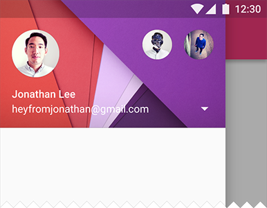
If you go deep down into the material intro guide, you’ll find the opacity value for the StatusBar:
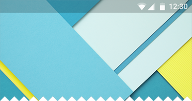
Let’s try that 20% of black. To do so, we can define the StatusBar as follows:
You will get:
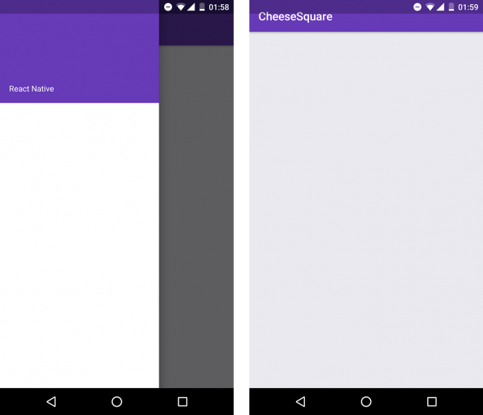
Now, we have the drawer above the status bar giving us a nice visual effect (you can use an image as a header too). However, we need to adjust our screens as you can see at the screenshot on the right. For that, we can just make a Viewwith the desired color to be our colorPrimaryDark:
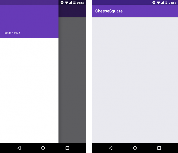
Make sure to show the view only on Android Lollipop and above
Now it will look like as we wanted:
Pitfalls of using StatusBar and how to avoid them
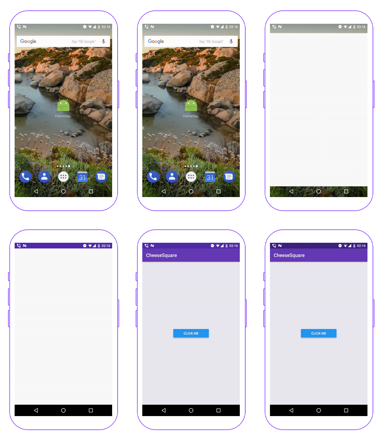
The main problem of using <StatusBar translucent /> is that it will load after the React JS context loads. So if you pay attention when opening the app, there is going to be a glitch after that loading because the status bar will become translucent and we will be moving the screen down to adjust it.
Check it out (check the button in the center):
This version uses bold formatting for react-native and MainActivity.java. You can paste it directly into Webflow. Let me know if you'd like any further modifications!
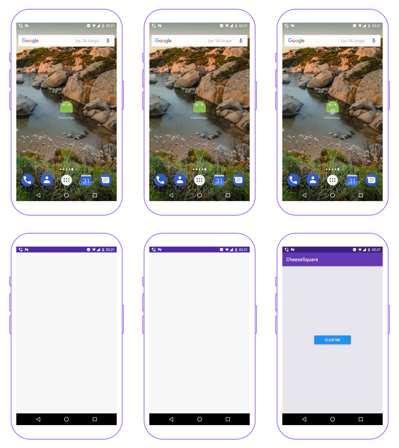
The important part here is just to call our function before super.onCreate(savedInstanceState) where the actual JS context initialization will happen.
With this, the glitch will be gone when you first open the app:
Summary
And that’s it! I hope to start seeing more beautiful drawers above the status bar from now on. Happy coding!


Learn more about Android
Here's everything we published recently on this topic.


